TACKLING UI BY COMPONENT & BRINGING OUT THE BEST OF JET
Drawing insights from an article review of Just Eat Takeaway’s app, I treated this as a mock brief, focusing on the idea generation phase of the design process over a 1-week sprint. My goal was to identify opportunities to modernise the UI and highlight their friendly, ‘next-door-neighbour’ brand tone through potential new or enhanced features.
CONCEPT PROJECT FOR JUST EAST TAKEAWAY

THE BRIEF
App needs visual refinement
Emphasise neighbourly tone
ARTICLE EXCEPRT
"Just Eat is another major player in the delivery space, and actually has far more options on its books than Deliveroo, having been on the scene a bit longer. The app isn't quite as slick as Deliveroo's, though, in particular lacking the ability to see where your order or delivery person actually is to get a sense of how imminent it is.
However, because many restaurants take advantage of the app's ability to waive delivery charges or hold discounts, you can often find really affordable and knocked-down prices on Just Eat that wouldn't be matched elsewhere.
It's also fairly common for smaller, independent eateries to be on Just Eat but not Deliveroo yet, in our experience, which can make it a good way to find local favourites without leaving home"
Max Mills
Journalist
THE OBJECTIVE
Identify opportunities to modernise the UI in the Just Eat Takeaway app, aligning it with competitor standards, and highlight areas where the brand’s friendly, ‘next-door-neighbour’ tone can be emphasised."
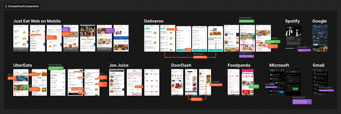
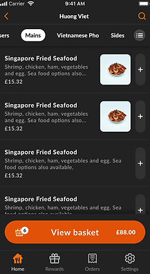
GETTING INSPO FROM OTHERS
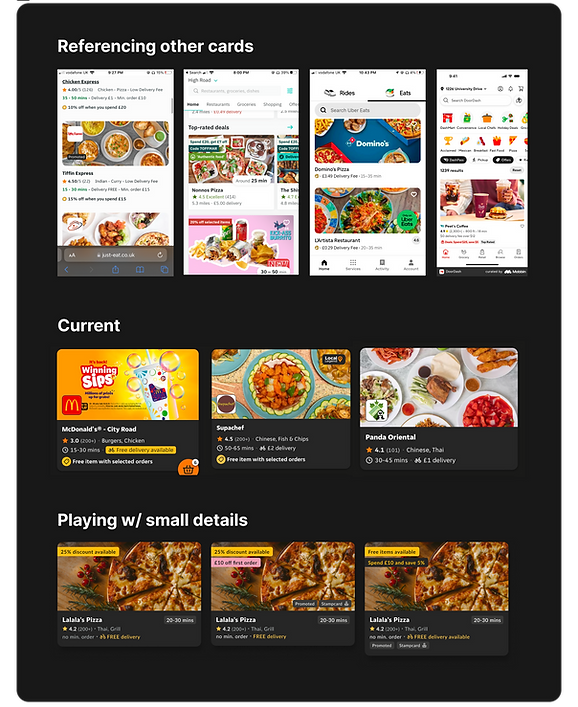
To kickstart this project, I analysed other products using Jakob Nielsen's 10 Usability Heuristics. I (1) highlighted examples of Aesthetic and Minimalist Design (in red), (2) identified a consistent communal tone across the products—common in the food industry—which aligned with Match Between System and the Real World, as well as Consistency and Standards (in green), and (3) recorded additional observations (in purple).
SETTING A THEME
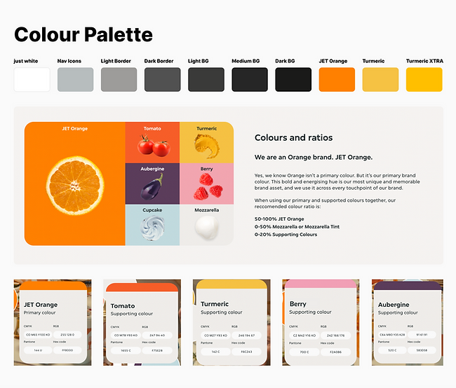
Before moving forward with the process, I like to establish a theme of colours I'm working with (taken from JET's branding guide and their app) to familiarise myself with stylistic constraints early on.
PART 1: AESTHETIC & MINIMALIST DESIGN
CURRENT APP OBSERVATIONS
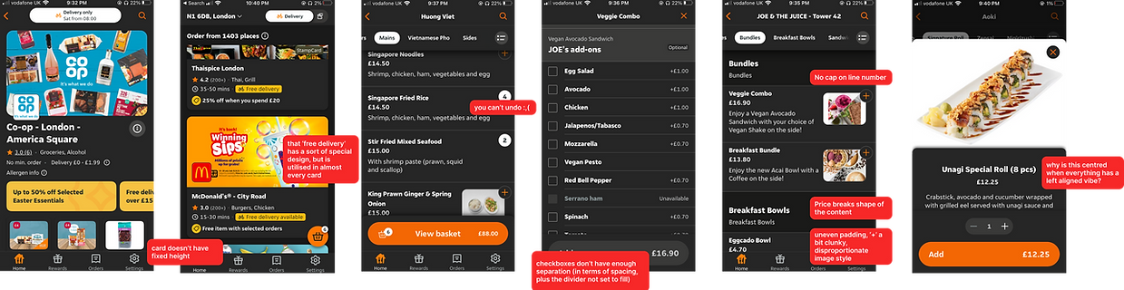
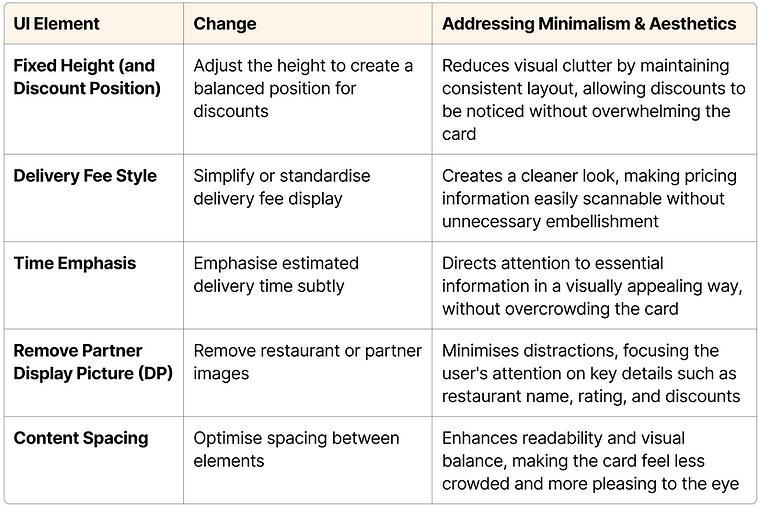
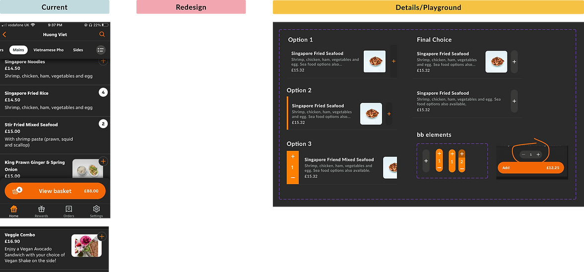
STAYING FOCUSED BY HONING IN ON HIGH USAGE COMPONENTS
Visual refinement is an ongoing process, and there are always opportunities for stylistic enhancements. The key challenge is prioritising these improvements. I chose to focus on two components that are frequently clicked in a food delivery app, as optimising these would have the most direct impact on user experience.
1
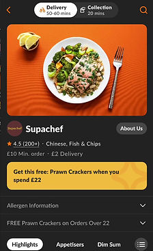
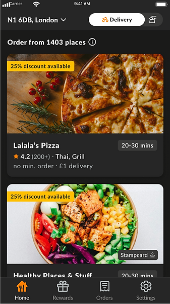
In Homepage: restaurant card
2
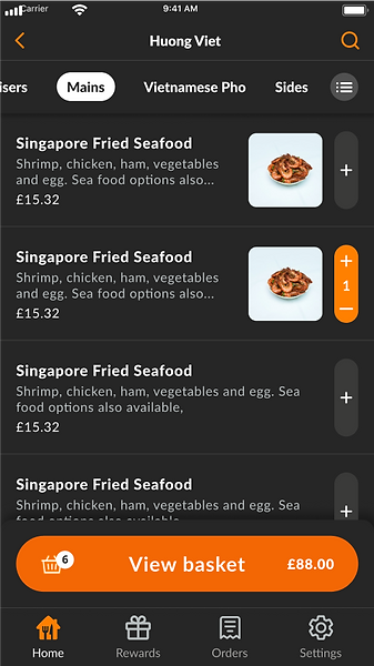
In Restaurant Menu: single product component
1
RESTAURANT CARD
STARTING TO ITERATE
1. Gather specific inspiration from references during the early exploration phase.
2. Document a few key variants within the current app.
3. Experiment with details, such as layout, colour, and spacing to achieve a minimalist and aesthetic look.
PROPOSED REDESIGN
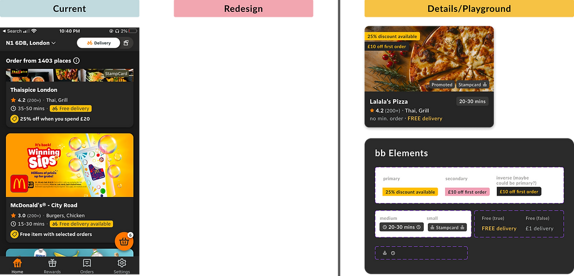
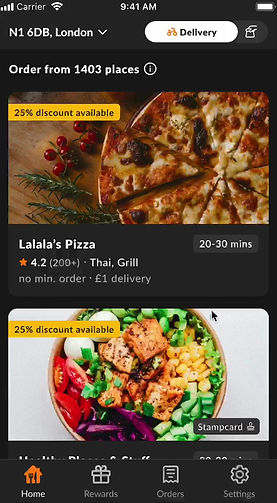
REDESIGN EXPLAINED
2
SINGLE PRODUCT COMPONENT
Text & Image: Hierarchy changes (font colour/size) • price position • fixed values (line # & image size)
'Add' Button: Colour updates • longer shape • removing absolute position • Clearer option to remove item
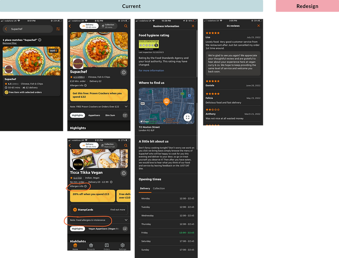
PART 2: BRINING OUT A NEIGHBOURLY TONE
HOW DO OTHER BRANDS DO IT
ASKING MYSELF:
1. How is credibility built for small and independent brands?
2. How do my friends tend to send me recommendations about 'hidden gems'?
3. What are products I've used that have clearly built trust?
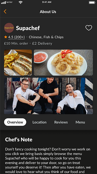
THE GUIDING QUESTION BECAME:
Where can I design for people to get to know who the local brand is?
IN THE END...
WITH SEVERAL DESIGN PROPOSALS...
It is now a matter of asking what is worth pursuing
Do people rate their homepage as more aesthetic as before?
Does this reduce the drop-off rate as people can more easily undo mistakes?
Are there more purchases made after clicking on About Us or perhaps less complaints?