EFFORTLESS SHOPPING
Looking to create clarity around a carefully curated inventory, this project focused on exploring information architecture. Guided by user research, the question to answer was how could I create an intuitive and trustworthy experiences for people to find the products they genuinely desired?
CONCEPT PROJECT FOR ALARA

PROJECT OVERVIEW
PARTICIPANTS:
Chloe Dare (solo project)
ROLES:
UX Researcher, UX & UI Designer
TIMELINE:
2 Weeks
TOOLS:
Figma, Zoom, Slack, Google Drive, Numbers
Alara’s goal was to increase sales through keeping users connected to their inventory by providing them with flexible navigation, while also maintaining their warm brand values.
ABOUT ALARA
Alara has been the city’s neighbourhood organic grocer since 2008, based in Russell Square. With a wholesome local attitude, this healthy grocer provides its customers with a specific selection of affordable organic products, sourced from a variety of suppliers. Alara has created a community in which its customers feel informed through transparent product information and have created a space for people to learn about sustainability.
THE CHALLENGE
Alara has found an opportunity to support the local community by offering a website for people to order some products online. The current state of the website has not been able to reflect the vision that Alara has. With numerous website visitors, there has been a limited number of completed purchases. The challenges for this project were to:
1. Increase website sales, while maintaining their brand image of a ‘local and friendly shop’.
2. Create a seamless and flexible navigation system where users could easily learn about, and purchase its highly curated inventory.
TOOLS
DISCOVER
Feature Inventory
Task Analysis
User Interviews
User Flows
DEFINE
Job Stories
User Flows
IDEATE
Lo-fi Wireframes
Card Sorting
Mid-fi Wireframes
Site Mapping
DELIVER
Prototyping
Usability Tests
Recommendations
Presentation
DISCOVERING & DEFINING PRIORITIES
COMPETITIVE
ANALYSIS
In order to prioritise client goals & discover patterns presented by competitors, I started a feature inventory to organise my research.
My featured inventory consisted of dividing features into ‘must’, ‘should’, and ‘could’ categories from the client's point of view. Furthermore, I added a number of other features that were present in the websites of their competitors. This allowed me to visualise the chronology of how I would tackle implementing certain features. This informed me that Alara already had many of the ‘must’ features which made it clear that low sales either had to do with the way these features were presented or that the other features on the table should be viewed as ‘musts’ to drive sales. Furthermore, this made it easy to see that Planet Organic would be the strongest competitor in this project.
To continue my competitive research, I identified the patterns in common checkout flows through task anayses to be clear on the most necessary steps and feel inspired by simple flows from competitors.
The fundamental steps to checking out online to buy a product:
1. Arrive at homepage
2. Search up an item
3. Read Product Description
6. Pay for product
5. Go through checkout process
4. Add to basket
USER INTERVIEWS
"I want to buy something I can’t find in a normal store, so usually something really specific."
"‘Local’ and ‘organic’ just give me the vibe that it’s more environmentally friendly and trustworthy."
Main takeaways after speaking to 6 users:
When people shop for food online, it is often for a particular item or to satisfy a certain dietary requirement. Frustrations begin when one or both of these things cannot be found.
Because people’s senses are limited when shopping online, establishing trust with the store’s values, products, and associated brands is crucial.
IDEATING SOLUTIONS

ESTABLISHING INFORMATION ARCHITECTURE
Card sorting my way to clear navigation
To improve search ease, I focused on clearly categorising Alara's inventory. Through an open card sort with six users, 44 categories were generated from 39 items. The table on the right shows how often users grouped items into each category. I noticed patterns in the results and used a colour-coded system to group similar categories (e.g., "Alcohol" and "Beer and Wine") based on similarities or close quantitative results. This helped identify where categories could be combined. Vertically aligned numbers in the table indicated items that users intuitively grouped together. Using these insights, I created a navigation system that reflected natural user behaviour.

DELIVERING & TESTING SOLUTIONS
MAKING THINGS BEAUTIFULLY FAMILIAR
"I love this website because it feels like a shelf"
When designing the interface of this website, I wanted to create a digital environment that emulated familiarity, from the comforting pantry in your home to the peaceful green spaces in nature.
TYPOGRAPHY
Primary: Lato
Minimal primary typeface to replicate the feel of healthy and clean eating.
Logo typeface which balances playfulness and professionalism.
COLOUR PALETTE

The analogous colour palette I chose was a varied array of soft greens and oranges to insight notes of both warmth to create a welcoming feel, and primary green to lead with a connotation of healthy and organic food, denoting Alara’s values of being environmentally conscious.
LAYOUT
Shelf-like Layout
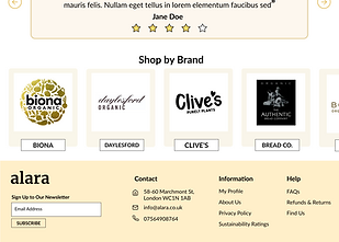
I wanted to allow users to feel like they were in their own pantry or looking at personal shelves of food when they go shopping. Guided by this desire to emulate the familiarity of physical objects, I ensured that the shapes within the website gave the block-like feel of a shelf.


TESTING & LEARNING
SUCCESSES
2 users
mentioned the efficiency of checkout.
2 users
quickly identified dietary filters as one of the most helpful features.
Additionally addressed the client's must-have and should-have requests accompanied by supporting discoveries made in the competitive analysis.
IMPROVEMENTS
All users
disliked the use of light orange as a background colour in certain areas and preferred green for better contrast.
1 user
found the menu categories intuitive, but the presentation of the inventory within the secondary navigation content-heavy, suggesting a reduction in information by utilising a 'see more' button.
With a more advanced prototype of the filtering system, an improvement would have been to focus more of the research on not only testing attitudinal results but also behavioural results through dietary-specific and trust-building tasks.
LEARNINGS FROM THIS PROJECT
This project was especially challenging because it stretched my ability to visualise a large quantity of data. Learning how to filter relevant findings into one designed flow, taught me to think very critically about how to prioritise user needs and what was set out in the brief. There are always going to be a number of opportunities for a designer to make improvements, but what is most valuable is having the stamina to pick apart numerous demands and discover what direction is the one you can provide the most feasible support in.